Data Vis Spotlight: Maps

This post first appeared in Kontinentalist’s newsletter, Notes from the Equator. Kontinentalist, a Potato company, monitors Asia’s latest developments and uses maps to tell compelling stories.
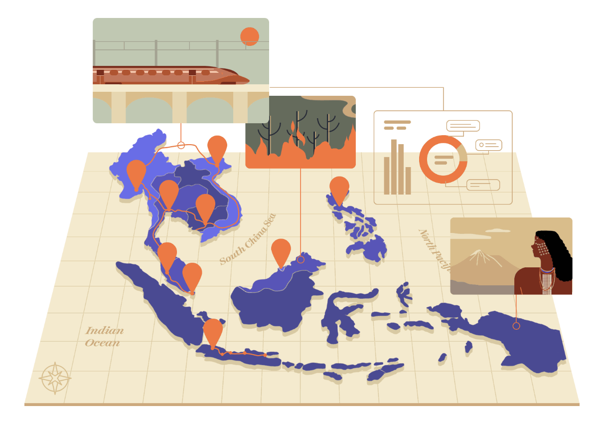
A map is one of the data visualisations that needs no introduction. Maps have existed for a long time, and they are now integrated into our daily lives in delivery food apps, Google Maps, and what have you. With how pervasive maps are, it’s easy to plug one into a story without much thought.
For this issue’s data visualisation spotlight, we share some ways you can tell stories using maps.
1. Create a customised, thematic base map.
When you apply your story’s theme to your map design, you can further immerse your reader in your story by creating an environment that makes them want to venture around and explore. This “Treasure” style by Mapbox, for example, reminds me of the “Choose your adventure” gamebooks I treasured as a kid.
Sometimes, this design is purely symbolic. The map design for Bella’s story on transgenders in Asia was based on the colours of the transgender flag. While not exactly a “best practice”—it assumes that readers know these colours as cultural symbols—Bella made a personal decision to pay homage to this minority group.
If you want to try your hand at designing your own map, read this excellent beginner’s guide by our designer Joceline.
2. Select colours based on your data type.
Colour is a powerful communicative tool in data visualisation, but it can sometimes become overwhelming if you’re not trained in colour theory. Here’s a quick guide on the types of colour schemes you should use based on your data type.
Categorical data call for distinctive colours, which you can generate by choosing a qualitative scheme. To communicate continuous data, choose a diverging palette. The point here is to show how your data point deviates from the baseline—like this dialect quiz, which shows how similar or dissimilar your answers are compared to the survey sample.
Another way to communicate continuous data is through colour gradients, which signal intensity. In this calendar vis, the lighter shade of blue signifies fewer fatal vehicle crashes, and the darkest shade on October 16 signifies the largest number of them.
3. Add a data visualisation on top of your map.
If this sounds controversial, that might be because we’re taking a leaf from the handbook of Charles Minard, who created maps in the 1800s. Take a gander at his flow map on French wine exports, in which he added a time series chart on the top right corner of his map.
We do think this format works better in print, where the secondary chart allows the readers to zone in on the details. Regardless, there is value in challenging ourselves to think of new ways to visualise data, rather than always sticking to “best practices”.