How I write data-driven stories

I’ve been a writer for almost two years now at Kontinentalist, a data-driven editorial studio in Singapore. In that time, I’ve interviewed my fair share of prospective interns, writers, and editors.
Almost always, when asked why they’re interested in the position, our interviewees answer something along the lines of, “to learn how Kontinentalist merges data and storytelling”.
I always feel slightly sheepish when this happens, because it’s not like we run a masterclass on data storytelling. Nor should we, because it’s an evolving form. And even though I’ve written a few such stories, I’ve learned, and continue to learn, about data storytelling on the job itself.
So, this isn’t some decisive guide on how to write data-driven stories. Rather, it’s a candid account of my methods and thought process based on my experience working with the medium.
Steps 1–2: Find the story angle / Get the data
This is where data-driven stories are unique.
For other story formats, the process usually goes like this: You start with a topic or story angle in mind, do further research, conduct interviews (if it’s a journalistic piece), and write the story. But as the name suggests, a data-driven story should be driven by data rather than have data play a supporting role.
That means making sure that your chosen data allows you to extract interesting takeaways and weave these key takeaways into a story. I have been excited by a story idea countless times, only to shelve it because of insufficient data (even after collecting data myself) or because the data were too thin to support a story.
But where do you start? Nowadays, data is everywhere and easily accessible. You’ll quickly drown in data and its endless possibilities if you don’t set some parameters. So I usually brainstorm story angles in two ways.
In the first way, I come up with a central question. What exactly am I looking to answer with data? And is this question best answered with data?
My story about Asian representation in the movies, for example, explored the central question of whether minority representation (Asian and Black) in blockbuster movies has improved since 1997. This narrowed the scope of the data I should be looking for. I eventually settled on IMDb’s list of blockbuster movies from 1997 to 2019, as this dataset gave me a list of movies for each year, their main casts, and gross figures.
In the second way, I comb through databases to come up with a story idea. I like looking through databases for inspiration; if the data are really meaty and interesting, I’ll think of ways I can use them.
Before downloading and using data wholesale, I always look at their sources as well as the terms and conditions of their use. There are no such things as “raw data”, data that you just find growing organically in the wild, untainted by human manipulation. All data have been cleaned to some degree and were collected based on certain criteria, and as a writer, I do my best to be mindful of this.
In fact, in “Graphesis: Visual knowledge production and representation”, scholar Johanna Drucker proposed that we think of data as “capta”, instead. Where data are considered objective information, capta refer to “information that is captured because [they conform] to the rules and hypothesis set for the experiment”.
So, look at the sources behind data. How were the data collected? Do they exclude certain groups or encode certain biases? Who are their intended audiences, and do they carry an obvious agenda?
No data are perfect, but we still ought to spend time thinking about these questions when data form the foundation of our stories. Having said that, here’re some of my go-to datasets for story inspiration:
- Data Is Plural, an archive of datasets by Buzzfeed’s data editor Jeremy Singer-Vine.
- Pro Publica, an investigative newsroom that focuses on public records in the US.
- Humanitarian Data Exchange, by the United Nations Office for the Coordination of Humanitarian Affairs (UNOCHA).
- Google Public Data Explorer will show relevant datasets in its results when you type a keyword in.
I recommend keeping a running list of databases, because you never know when they may be relevant. To get your weekly or monthly dose of data inspiration, consider subscribing to data-vis-related newsletters like Storytelling with Data, Chartr, and our newsletter! 😊
Step 3 (Optional): Create your own dataset
But what if you can’t find a satisfactory dataset or there are simply no datasets for the story you want to tell? One option is to go back to the drawing board with your central question—perhaps data isn’t the best way to answer it.
Alternatively, you can forge ahead and collect your own data.
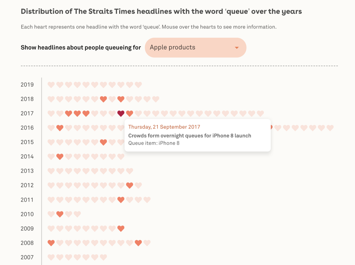
My stories so far have been mostly built on self-collected data for two reasons. First, the stories tend towards the quirky, like finding out what Singaporeans queued for over the years and comparing the mass of instant noodle packets with the average mass of a nation’s citizens.
Alas, institutions have better things to do with their time and resources than collect such data.
Second, as with much academic research, data repositories tend to be Western-centric, and there is a dearth of datasets specifically about Asia. This goes back to my earlier point about thinking critically about data.
Even reputable data repositories such as the World Bank and the United Nations have blind spots baked into their data. For instance, how does the World Bank decide what counts as a data indicator when measuring progress? Whose definition of “slum” are they using when they collect their data?
The brief answer is that these definitions are often modelled after Eurocentric terminologies and standards of progress. The decolonisation of data is a complex topic that I can’t do justice to in this short piece, but if you’re interested in learning more, I’d recommend you check out the works of institutions like the Urban Indian Health Institute and Montana Budget & Policy Center.
At Kontinentalist, our mission is to balance such disequilibriumsby bringing Asia, and Asian perspectives, to the forefront of global conversations. But this can be tricky if the data themselves were created within social structures with encoded biases. Collecting your own data is one way to circumvent this, because you have control over what to collect and which sources to use.
So, how do you actually go about doing that?
Often, the effort required to collect data depends on your comfort level with programming. You could write some code to gather the data as its output, or—if you’re a noob like me—manually key the data into a Google spreadsheet. The former method is obviously superior in a sense, because it minimises the possibility of human error.
Still, I want to make a case for the manual collection of data, painstaking as it is.
Typically, you start by collecting data based on some basic parameters that you have outlined. You create and populate basic columns like names, dates, and so on. But as you dive into a data source, you may find variables that you had not considered beforehand, so you start adding more columns. You probably won’t use all of your columns, but doing this gives you more material to work with.
In my Asian representation story, I added the names and ethnicities of the movies’ directors as an afterthought. I thought, “Well, no harm collecting it, in case it’s useful later.” And it was; those columns opened up a whole new dimension to the story by showing how the ethnicity of directors correlates with the degree of minority representation in their movies.

As you can see, the process of finding your story angle, getting the data, and creating your own datasets isn’t always linear. While collecting data, you may want to include angles to your story that you hadn’t thought of during your brainstorming or outlining process.
Step 4: Clean your data
At this point you may be wondering, so when exactly do I get to the writing part?
I’d say that I spend 95 percent of my time on data, and the remaining 5 percent on actual writing. This is a good thing; I can spend just 5 percent of my time writing only because of all the prior work I’ve done collecting and cleaning up the data.
In fact, I see data cleaning as part of the editorial process, too. Let me explain: the main purpose of data cleaning is to make it machine readable and prepare it for analysis. This means making sure that each cell contains only one number or string of text, removing spaces, checking for spelling mistakes, and so on—which makes it rather like copyediting.
As you immerse yourself in data cleaning, you should get a sense of the story’s shape. Think of it as removing weeds and relocating your flowers to get an idea of your garden’s landscape.
From there, it will become clear which variables to keep or remove to maintain your story’s focus. You’ll have to consider whether a variable has sufficient data (i.e., no missing data), and whether it can be developed more fully as a subpoint compared to other variables.
This is, of course, a subjective matter.
Step 5: Analyse your data and find data vis types
Now that you’ve cleaned your datasets, here’s the moment of truth. You feed them through a program to see if they reveal any interesting patterns.
For this, I mainly rely on Flourish, a plug-and-play data visualisation site. Kontinentalist uses the paid version, which gives us access to different visualisation types— but the free version of Flourish is pretty good too.
There are plenty of free, quality sites such as Knight Lab, RAWGraphs, and Data Wrapper that can quickly visualise your data. The point here is to get broad patterns—like outliers and general trends—and see how you can use them to answer your central question.
With larger datasets, I enlist the help of our front-end developer Aishah to analyse the data using R.
The more familiar with data visualisation I get, the less I rely on just plugging the data in and experimenting with different visualisation types to see what fits. Instead, I select my visualisation intentionally, and often refer to an A3 printout of this chart by the Financial Times, which sorts data-vis types according to their function.
This forces me to think hard about the message I want to convey and choose the visualisation that will communicate said message in the most concise and foolproof way possible. I also refer to this site for real-life examples of how data visualisations are used and how data storytellers have expanded the form.
For me, this is where I can really flex my creative muscles and have fun with the data. When you sketch out the data visualisation, add design touches, and consider colour combinations and interactivity, you’re storyboarding to ensure that your piece has a nice balance of visualisation and text as well as its own logical, rhythmic flow. It’s as much art as it is data science.
For initial ideas, I prefer to sketch the visualisation out by hand. It’s faster, and I can quickly add anything I like. It’s also much easier to just show a sketch to my colleagues and ask for their feedback.
Here’re some examples of my sketches and their end products:


Now that we’re working from home, I’ve been using Figma to sketch out my visualisations. It’s pretty beginner friendly: you can add shapes and colours, and even draw freehand on the canvas. Also, some things are much quicker with software, such as copying, pasting, and colouring things with a click.
Still, I recommend sketching by hand during the ideation stage. You’ll want to brainstorm, make quick sketches, and discard bad ideas quickly; Figma may hinder ideation because you may waste time trying to make a square perfect.
Use tools like Figma when you’re pretty clear on your direction, and all that’s left are the details.

After putting together a storyboard or some preliminary sketches of the visualisation, I’ll call for a small huddle with our designers and developers. They give feedback on feasibility and the visualisation’s suitability to the data, and we decide together on the data visualisation to use. This will probably be tweaked along the way, but for now, we need to agree on something to get started.
As the writer, my main responsibility is to communicate the story angle as best I can (going back to step 1—figuring out the central question), show references or sketches of what I have in mind, and explain the datasets themselves.
Step 6: Write the story
Finally, you’re ready to put pen to paper!
By this stage, you should be well acquainted with your data and its findings. Writing is just a matter of piecing it all together into a coherent story.
You’re understandably bursting with excitement to share your findings. Or perhaps you’re so sick of the data that you just want to get the writing over and done with. I swing between these two extremes, personally.
Regardless, you’re a writer—a storyteller—and it’s up to you to weave everything into an absorbing narrative.
Which, urgh, is a difficult task in itself, not counting all the things you had to do before this moment. You have to make sure that you’re writing for your audience, that your piece fulfils your company’s mission, and so on. Juggling all these doesn’t come easily to me, but here are some methods I’ve found useful in guiding my writing:
- Introduce your central question, then jump straight into answering it. Segment your answers in different sections.
- For me, a good explainer guides the readers through an issue step by step while introducing evidence (video snippets, interviews, data visualisations, etc.) to build its case. Vox does this really well, all while keeping the tone engaging and conversational.
- Communicate one insight per data visualisation. Make sure that insight is featured prominently, like in your title. Don’t bury it under an interaction (i.e., hovering), because your reader might not interact with your vis.
- Create two columns in your preferred writing tool: one for text, the other for data visualisations.
Let me elaborate on that last point.
I usually create two columns in Google Docs for stories that have a scrolly-telly element, in which some parts of the data visualisation change as you scroll through the story. Maybe even three columns if the story has annotations.
Doing this reminds you to make sure that your text and data visualisations communicate the same point. It guides your writing, and also helps your designer and developer see where and what the transitions are in your story.

Is that all there is to a data story?
I’m still figuring this out for myself, too.
I began thinking more critically about what counts as a data story after reading this great piece by Joshua Smith, in which he points out that a lot of data visualisation storytelling isn’t actually “storytelling”. The way Smith sees it, many data pieces are just “information presented in an interpretable presentation with a logical flow”.
Stories, in contrast, have well-defined characters, a plot with impactful events, and emotion.
We can see the effect of diluting storytelling in our community: when was the last time a data visualization caused you to emotionally relate to characters that weren’t like you? When was the last time you felt anxiety over a plot heading toward some sort of climax in a data visualization? When was the last you felt compelled to keep reading because you’d become so attached to some characters?
Not that he’s preaching that all data visualisations need to conform to those standards. Indeed, he further explains,
A visualisation isn’t more or less powerful, beautiful, or important because it does or doesn’t tell a story. Therein lies the problem: storytelling is talked about as one of the critical things every data visualization should do.
What he’s putting forth is that as a community, data-vis practitioners should strive to harness the rhetorical power of narratives and humanise data in a way that makes them matter to our audience.
Reading that was an aha! moment for me, because my priority has often been to present my findings in a clear and logical manner. His piece made me realise that data are not just a means to an end (i.e., answering a central question) but also can be a rich source of storytelling in themselves.
I still have lots to learn in data storytelling, in terms of technical know-how and my study of the field. Initially, I was intimidated by all of it, but two years on, I’ve learned to embrace it because I know I’m in good hands. Not just with my colleagues, who are all friendly nerds in their own ways, but also the thriving data-vis community, which has been generous in sharing its knowledge and thoughts.
I hope that with this write-up, I’ve contributed—in my own small way—to demystifying the process of writing data-driven stories. In doing so, I hope this encourages more people to think about data more critically and perhaps even join the field.

About the author
Isabella Chua is a data vis storyteller at Kontinentalist.