Coding a Kontinentalist Story

In my eight months of working with Kontinentalist as a front-end web developer, I’ve worked on five hard-coded stories and a handful of auxiliary data vis for other normal scroll stories. This roughly equates to one and a half months of work to produce a hard-coded story from conception to end.
For that reason, I’ve settled into a comfortable routine when it comes to bringing a Konti story to life. Since we tell visual stories, I’ll be using graphics and annotations to talk you through my process.
A Konti story is data-driven. To put it plainly, this means that there is some kind of data visualisation between chunks of paragraphs in a story. These visualisations may be static or interactive, and they may take the form of a chart, map, infographic, and so on.
Step 1: Concept meeting
By the time the baton reaches me, the story has been pitched, and some form of data has been collected by the writer. The writer would also have an idea of how the story will flow and thought of some visualisations for the story.
At this point, my main concern is how the data structure looks like. Are the variables categorical or continuous? Are we working with a time series? Is the vis going to be interactive or static?
I think by now, most writers are damn tired of me asking, “What’s the variable for the X and Y-axis?” But hey, if the variables don’t match the proposed vis, it doesn’t matter how nice it looks, because it’s not gonna work. If you’re curious about this from the writer’s perspective, Bella’s written a great piece on how to tell data-driven stories.
We sort this out in the meeting, which ends with successful storyboards and sketches of the proposed data visualisations for the story, before parting ways.
It doesn’t mean we work in silos from here, though.
During this time, the writer passes me the work-in-progress dataset with the agreed-upon variable columns, and the designer passes me the wireframe and art boards for the story on Figma. There’ll be back and forth amongst us, which may result in the designer tweaking the colour palettes, fonts, and structure.
Vis Coding
If you haven’t gathered by now, I’m the kind of person who likes to lay everything out before I start. It helps me see the big picture in developing the story. I mean… life is already so full of uncertainties; why make it harder by not planning? It’s a very Type A thing.
Our website is built on Vue JS, which means components are my best friends in structuring the story. I start by building the index.vue file and slowly going deeper into the layers of the story by following the storyboard from the earlier meeting.

The backbone of our data visualisations is — you guessed it—data. Sometimes, the data isn’t quite ready when I’m coding the vis, so I populate my .csv files with dummy data instead. It’s no problem, because the data structure has already been defined, and I just need to swap the real data in when it’s ready.
I use mainly D3 JS for interactive charts and Mapbox GL JS for anything related to maps. D3 JS is cool because it builds on layers of SVG components to make the final piece.

Take the bar chart, for instance. To code a bar chart using D3, I break the charts down into drawing the following:
- Base (the canvas for drawing the different elements of your chart)
- Axes (both X and Y)
- Bars
- Extra labels (if any)
- Interactivity (if any)
I can’t say that there are a set number of steps to follow when coding charts, because this inherently depends on the type of chart that the writer wants.
For any new type of chart that I’m coding for, I research sample codes that already exist on the web. This helps me break down what I need to do.
For example, in our recent project with ISEAS, I was tasked to build a radial tree and a bar chart. The vis comprises a tree and a bar chart, arranged along the circumference of the circle. If you stare at this long enough, it becomes clear that the chart is gonna take in hierarchical data with a parent–child relation, as well as numerical data for the height of each bar.
This points to d3.tree() and d3.arc() as possible tools to create the visualisation with.

When the coding is done, it’s time to assemble all the pieces together.
I replace my lorem ipsum placeholder text blocks with the final story text from the writer.
Then, I check my work against the wireframe on Figma to ensure that it follows the colours, fonts, and spacing to a T. Our designer is very strict about margins and paddings.
I try to break my story a few times to check my code for bugs or anything else that might go amiss.
Once I am satisfied with my work, the story is ready to go on our staging platform for the team to test.
Nitty-Gritty
During this phase, which I call the “nitty-gritty”, writers and designers preview the story and do all the different checks necessary. I always reserve at least four working days for this.
Ugh, this is my least favourite part—it’s tedious, and I know there’ll be a lot of back-and-forth about changes that need to be done.
Even so, I think that it’s a great exercise in keeping my ego in check, because I’m allowing my work to be torn apart as the team reviews it for bugs, website compatibility across different browsers, discrepancies in text formatting, and aesthetic anomalies. It’s like asking your team to try breaking your work before anyone in the public sphere does, which would be worse.
There’ll always be some things that I miss out during coding. Here is an example of my to-do list for the most recent nitty-gritty phase. Mostly, these are inputs from different members of the team.

Once the writer, designer, and developers are satisfied with the final product, we’re ready to go live on Kontinentalist.com.
And that’s how our data stories are coded!
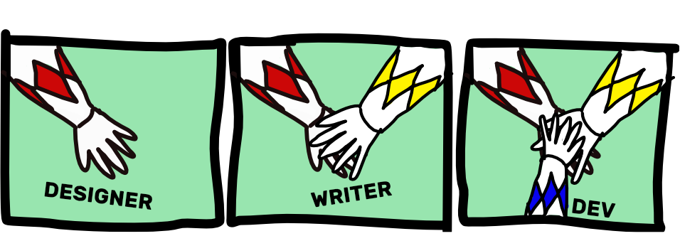
At the end of the day, a hard-coded Konti story is a labour of love shared by the writer, designer, and developer.
Every hard-coded story that I work on goes through the same methodical process from start to finish. But after each story, I refine the aforementioned routine.
With my first story, I didn’t plan enough time for testing, and I’ve learned to carve out time for user testing and feedback, because I know that the team will always come back with feedback. My code is also cleaner now than when I first started. I’m much better at considering responsiveness in coding visualisations for mobile devices, for instance.
Each story is unique because there’s always something new to try, and that’s one thing I like about my job. It’s like levelling up and filling your data vis inventory with charts of varying degrees of difficulty. Ultimately, I want to be able to design a vis from scratch, like Nadieh Bremer and Shirley Wu have done.
But that’s for another time.

About the author
Siti Aishah is a developer working at Kontinentalist.